What are the boxes and whiskers in a boxplot?
What are the boxes and whiskers in a boxplot?

We use boxplots to show the distribution of data mainly through four quartiles (Q1, Q2, Q3, Q4). The boxplot has two whiskers (Q1, Q4), two smaller boxes (Q2, Q3) and a larger central box (Q2, Median, Q3) known as the IQR or interquartile range.
The IQR captures the middle half of the data, or the data excluding the top 25% of data and bottom 25% of data. Q2 to the Median (black line) represents data that fall within the second quartile, and the Median to Q3 represent the third quartile of the data.
Remember that the vertical width of the boxplot tells you about the spread of data, not how many data points it encompasses. For example, Q1 and Q4 as seen above both represent 25% of the data (so if this was a variable with 100 data points, each would reflect 25 data points). But Q1 is much more spread out than Q4, meaning that there is more variation within the lowest 25 data points compared to the highest 25 points. But both only reflect 25 data points each.
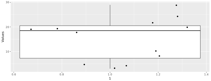
In the boxplot below, we can see the distribution of the following values (n = 12):
3, 4, 5, 8, 10, 18, 19, 19, 20, 22, 24, 29
We have 12 values, so if we include the dots for each value along with the boxplot (using the gf_jitter() function) we can see that each quartile contains 3 points. We can also see that Q2 and Q4 have more spread than the other two quartiles
Boxplots and Outliers
If we take the same distribution above and just change the last two values from 24 and 29, to 55 and 60:
3, 4, 5, 8, 10, 18, 19, 19, 20, 22, 55, 60
We get the boxplot below:
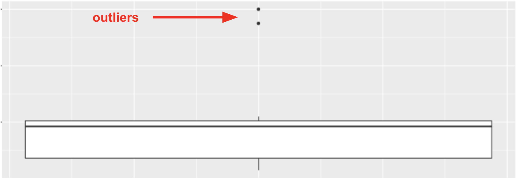
The points that appear on a boxplot are the outliers. If they appear above the top whisker, they are outliers because R has checked whether these values are greater than Q3+1.5*IQR. If they appear below the bottom whisker, they are outliers because their values are smaller than Q1−1.5*IQR. When there are outliers, the end of the whiskers depicts the max or min value that is not considered an outlier.
What types of variables are used in a boxplot?
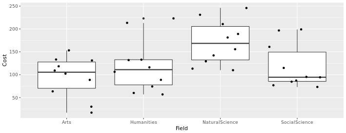
Also note that the boxplots above are displaying the distribution for a single, quantitative variable, and that the horizontal width of the boxes (along the x-axis, in this case) does not mean anything. If we wanted to compare boxplots across the groups of a categorical variable, we could do so, as seen below. In this case, we can compare the distribution of textbook cost (a quantitative variable) for four different academic fields (a categorical variable). Again, the horizontal width of the boxes is not meaningful.
Switching the variables on each axis
We can also switch the variables for the axes of our boxplots if we prefer to view them that way, by switching the variables around the ~ in our code. For instance, the code below produces the boxplots above:
gf_boxplot(Cost ~ Field, data = TextbookCosts) %>% gf_jitter()
But if we switch around the variables, like so:
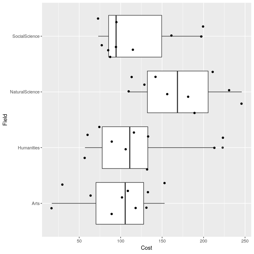
gf_boxplot(Field ~ Cost, data = TextbookCosts) %>% gf_jitter()
We get the visualization below. Notice that now the cost of the textbooks is along the x-axis now, and the groups (Field) run along the y-axis. When our boxplots are displayed in this format, now it is the vertical width of the boxes that is not meaningful.
Related Articles
gf_boxplot()
The gf_boxplot() function will generate a boxplot (also known as a box and whiskers plot). A boxplot splits the data into quartiles, where each whisker and each half of the box contains 25% of all the observations. They are helpful for visualizing ...Boxplots
Note: If you are viewing this article within the Help Desk widget from within the course textbook, we recommend opening the article in a new tab with the button in the top right corner (as seen below) so that the images will be easier to see. A ...gf_jitter()
The gf_jitter() function will generate a jitter plot. A jitter plot is a point plot (similar to a scatter plot, such as gf_point()) but the points are moved slightly ("jittered") so that they do not overlap as much. This can help make it easier to ...Five-Number Summary
The five-number summary is a handy way to describe the spread of a distribution around its median. To calculate the five-number summary, we first sort the data points from smallest to largest along the scale on which the variable is measured. Next we ...