Five-Number Summary
The five-number summary is a handy way to describe the spread of a distribution around its median. To calculate the five-number summary, we first sort the data points from smallest to largest along the scale on which the variable is measured. Next we divide the data points into four equal-sized groups, from smallest to largest. These groups are called quartiles. It is important to note that what is equal about the four quartiles is the number of data points included in each. Each quartile contains one-fourth of the observations, regardless of what their exact scores are on the variable.
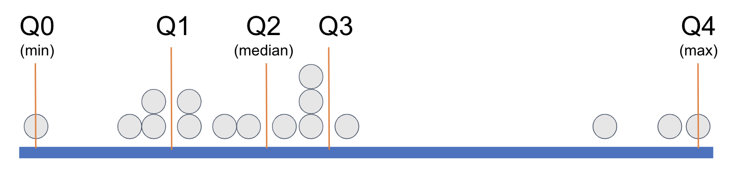
In order to demarcate where, on the measurement scale, a quartile begins and ends, statisticians have given each cutpoint (the orange lines) a name: Q0, Q1, Q2, Q3, and Q4. When statisticians refer to the five-number summary they are referring to these five numbers. Q2 is just another name for the median; Q0 and Q4 are the minimum and maximum, respectively. The easiest way to think of Q1 is as the median of the lower half of the distribution; Q3 can be thought of as the median of the upper half of the distribution.
The five-number summary can be visualized with boxplots. For more information see: boxplots; or gf_boxplot.
Additional Notes and Information:
I hand calculated the five number summary and it’s not the same as what I got from favstats(). What’s going on?
In reality, there are many different ways to calculate Q1 and Q3. For this reason, your manual calculation based on finding the median of the lower half of scores, for example, may not match what R calculates as the value of Q1. R actually gives you nine different options for calculating Q1 and Q3! The favstats() function uses the method most widely used by statisticians (R refers to this method as type=7), so in general we will go with that one.
How favstats() Calculates Q1 and Q3
Let's use an example to understand how favstats() calculates Q1 and Q3. Assume we have the following 20 data points:
4, 5, 10, 11, 12, 15, 17, 18, 19, 19, 20, 20, 21, 25, 30, 30, 36, 39, 47, 50
Because there are an even number of data points, there is no "middle number." Counting from the bottom, the 10th number is 19, the 11th is 20. So, the median (Q2) is 19.5, the average of these two.
Now take the bottom half of the distribution. If we calculate the median of the bottom 10 numbers to get Q1 using our same method we would take the average of the middle two numbers, which are 12 and 15. This would yield a Q1 of 13.5. Easy enough. But wait: favstats calculated Q1 as 14.25. How did it arrive at that?
It starts in the same place we did, recognizing that Q1 should fall in between 12 and 15. But instead of averaging the two, it uses a different method to find the cutpoint. First, it calculates the position where the Q1 should be using this formula: 0.25*(n-1)+1
In this case, the position would be (0.25 * 19)+1, which is 5.75. This decimal point after the 5 locates exactly where, between the 5th and 6th number, the Q1 should be. If the 5th number is 12 and the 6th number is 15, Q1 would be 75% of the way from 12 to 15. We can calculate that by multiplying 0.75 times 3, which is the distance between 12 and 15. This comes out to 2.25. If we add this to 12 (the lower number) we get 14.25, which is what favstats reports as Q1!
Related Articles
favstats()
The favstats() function will compute a set of common summary statistics ("favorite stats") for a given variable, including the five-number summary (minimum, Q1, median/Q2, Q3, maximum), the mean, the standard deviation, the sample size (n), and the ...Boxplots
Note: If you are viewing this article within the Help Desk widget from within the course textbook, we recommend opening the article in a new tab with the button in the top right corner (as seen below) so that the images will be easier to see. A ...gf_boxplot()
The gf_boxplot() function will generate a boxplot (also known as a box and whiskers plot). A boxplot splits the data into quartiles, where each whisker and each half of the box contains 25% of all the observations. They are helpful for visualizing ...sample distribution
When sampled data—units that were selected and measured—are shown in such a way where we can see patterns of variation (such as shape, center, and spread); sample distributions can be seen in visualizations such as histograms, boxplots, etc. but also ...aggregation
Aggregation is putting together separate elements (e.g., when we aggregate data, we might be putting separate data values together into one summary statistic).