gf_facet_grid()
The gf_facet_grid() function will create separate plots for each group of a categorical variable. It can be chained onto plots such as gf_histogram(), gf_jitter(), and gf_bar().
 Example 1:
Example 1:
# Density histogram of Thumb faceted by Gender
gf_dhistogram( ~ Thumb , data = Fingers ) %>%
gf_facet_grid( Gender ~ . )
Example of output from running the code above:
Example 2:
Example 2:
# Bar plot of RaceEthnic faceted by Gender
gf_bar(~RaceEthnic, data = Fingers)%>%
gf_facet_grid( Gender ~ . )
Example of output from running the code above:
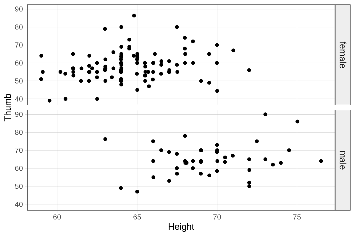
Example 3:
Example 3:
# Jitter plot of Thumb by Height faceted by Gender
gf_jitter(Thumb ~ Height , data = Fingers ) %>%
gf_facet_grid( Gender ~ . )
Example of output from running the code above:
Related Articles
gf_bar()
The gf_bar() function creates a bar graph. It can be used to visualize the distribution of a categorical variable by counting the number of observations for each group of the category. Bar graphs can also be used with the gf_facet_grid() function. ...gf_density()
The gf_density() function will overlay a density plot onto a density histogram (i.e., gf_dhistogram(), not gf_histogram()). The density plot is a smoothed out version of the distribution. They can be helpful when you want to get a better idea of the ...Faceted Plots
Faceted plots are meant for use when you have a categorical variable. You can use the categorical variable to partition the data into different groups and the groups are then plotted in different panels called facets. Thus, you can use a facet grid ...gf_lm()
The gf_lm() function overlays the best-fitting regression line on a scatter plot when chained onto gf_point(). Example: # adds a regression line gf_point(Thumb ~ Height, data = Fingers) %>% gf_lm( color = "orange", size = 2 )gf_histogram()
The gf_histogram() function will create a frequency histogram for a quantitative variable. This means it will show the number of cases observed in the data for each value of the variable. (See gf_dhistogram() for information on density histograms). ...